September 21, 2014 @ 6:28 AM
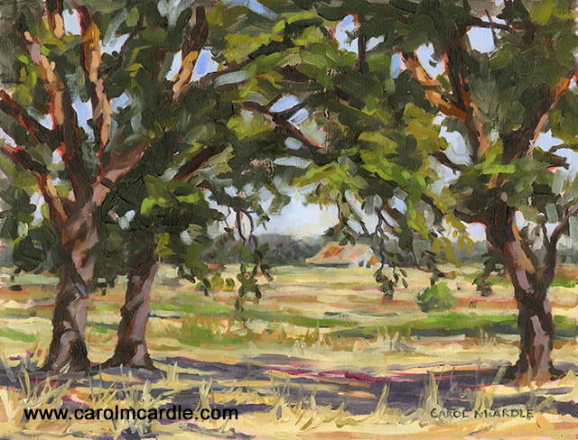
"Oak Tree Canopy" Oil 12" x 15"
What is my Art about?
I could write a book trying to answer that question but I don't know if I would succeed in hitting the nail on the head. It is just so out of synch to try putting into words something that has so many abstract aspects and many facets and nuances. Having said that there is one aspect of my painting that I've been thinking about today.
I like to escape into nature. I'm dependent on the effects nature has on my whole being. It is impossible to describe - like the effects love has on your soul, but here goes.
Being in the midst of Nature.....
Makes me breathe deeper - it's as if not just my physical lungs fill as I take in the wonderful air but ...
Read More
September 20, 2014 @ 6:31 AM
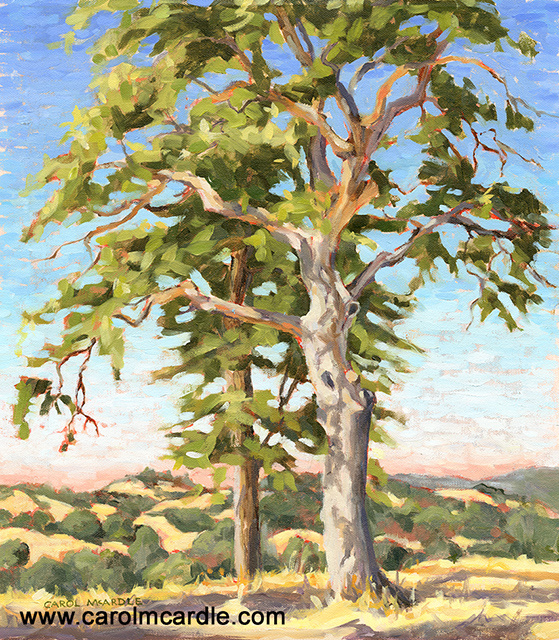
"Morning Oaks on Dogtown Road" Oil 16.75" x 14.5" $1,600
This painting is one of 6 new pieces that I painted plein air on my recent visit to the beautiful Gold Country in California. I had over two weeks of a packed visit staying with friends. We painted together as well as visited many wonderful places from the magnificent Yosemite National Park to little local areas that were so full of history, charm and beauty. The landscapes were so different from Florida! Hills! Lots of hills, lots of oak trees, many types of evergreens and pine trees at higher altitudes, vineyards, old barns and so much more. My eyes (and camera) were busy all the time trying to take it all in!
I am honored that I was invited to teach two days...
Read More
August 22, 2014 @ 9:00 AM
I have re-written my Artist Statement for what must be the zillionth time! As artists we are supposed to have a brief statement describing our work. Sounds easy enough until you try to write one. Trying to put what your visual work is about in words is hard enough. Trying to put that into a FEW words is almost impossible!
I could write a book about what my paintings are about and still not come close to describing why, how and what my art is about. There are so many subjects to cover and so many points about each subject and they all relate to each other. Then those subjects about my art inevitably relate to my life, my personality, my life's events and more. Throw in the history of art and how my art and techniques relate to that; add...
Read More
August 9, 2014 @ 12:20 PM
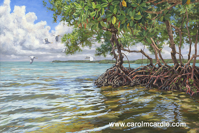
My new Florida painting celebrates the colors and moods of the Florida summer or as we call it the rainy season. Every afternoon the huge white cloudheads build and build in the deep blue sky untill they burst with the aftrnoon rainstorms and then as quickly as they came they are gone again, the sun is back and it is as if it never rained!
In the Florida summer the greens are greener, the blues are intense, everything is growing so fast you can just about see it and it is HOT and HUMID - and I wouldn't want to miss it for the world! Here's my new painting that celbrates the Tropical summer in South Florida
"Summer Mangrove Melody" Oil 40" x 60"
Read More
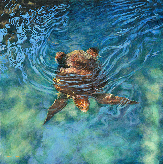
July 3, 2014 @ 4:46 PM
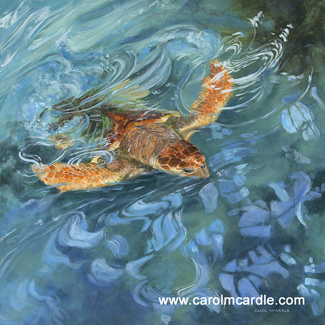
"Aqua Champion" Acrylic 30" x 30" is my second turtle painting this month and I got my inspiration from rescued turtles at Miami's Seaquarium. They have a beautiful lagoon with a walkway above it going all the way around. I walked and ran around it many times taking photos as I urged the turtles to move, swim, change position, face the other way and more. I was a mad woman for an hour or two all in an attempt to create paintings that capture the beauty of marine turtles swimming among mangroves in the light of the Florida sun. Such beauty deserves to be shouted from the rooftops.
Read More
June 9, 2014 @ 8:34 AM
All of my art reflects my love of nature. My paintings hold the beauty of the natural world up to grab attention and remind us all of what we are loosing everyday. The underlying message is protect, conserve and save our world.
Today is World Ocean's Day and in lucky timing to honor it I have just finished this piece, "Water Baby" acrylic 36" x36"
I usually work in oils but decided to paint this water and turtle piece with acrylics. My reasoning was that I would be doing many layers to capture the fluidity of the water and reflections and the quick drying acrylics would save me days if not weeks of drying time between the layers. Also, I figured the transparency of acrylic paints would be a plus for the layering....
Read More
June 1, 2014 @ 12:37 PM
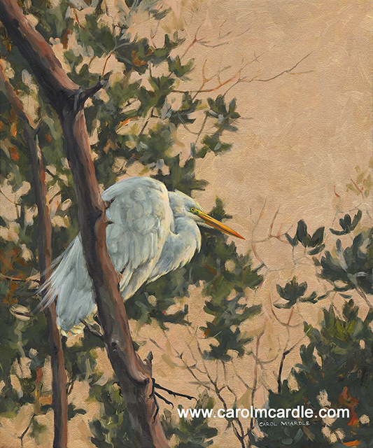 What I wanted to do in this oil on acrylic, or mixed media painting is capture the egret posed in the scintillating light of post-sunset. In those moments, before darkness descends, the air has a stillness and yet it gently vibrates with the second by second dimming light. The color of the light is unlike any other and has a magical feel to it. I am always transported to a different place in those few moments and then, before I know it, it is dark.
In this great egret painting I used many layers of transparent iridescent glazes for the background color to imitate the post-sunset, pre-night light. You cannot see this in the photograph of the painting, you have to see it in real life.
I saw this scene at Ding Darling Wildlife Refuge, ...
Read More
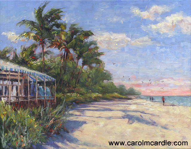
May 20, 2014 @ 10:19 AM
Beach painting is so much fun but it is still work, as all painting is. Just because artists may enjoy their work does not make it effortless, quite the opposite. Artists are focused and zoned in when they create. Every stroke takes thought, every nuance of color is a deliberate choice. Artists choose which brush, how thin or thick the paint should be, what value should the color be and so much more. Artists have to solve a multitude of visual puzzles for each painting and make endless decisions on how to portray their subject.
Another thing, having a "natural talent" does not make an artist! It takes years and years of learning, practicing, thinking, scheming and more to create artWORK. That must be why it is called that! Just ...
Read More
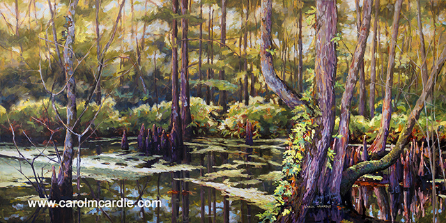
May 20, 2014 @ 9:45 AM
Because I paint from life and because I live in a place I love it is no surprise that my subjects for my paintings are what is all around me! I have always been awed and uplifted by nature. I go to preserved areas to find nature such as State Parks, National Parks, Wildlife Refuges, and more to find my inspiration. Here is a painting of a cypress tree swamp inspired by the amazing Six Mile Cypress Slough, Ft. Myers, FL
"Cypress Hush" Oil 30" x 60"
Read More
February 16, 2014 @ 10:46 AM
 "Perfect Paradise" Oil 11" x 14"
In the last year and a half I have been much more focused in Naples, Florida than other areas in South West Florida. The reason? I have a few.
1. The main gallery that represented me, Galerie du Soleil, moved to Naples to a beautiful new location.
2. I began to make regular trips to Naples to plein air paint the local scenery with a group of arists led by the wonderful, iconic Naples artist Phil Fisher.
3. The Guess Fisher Gallery expanded to a second gallery, Guess Fisher Gallery: Nestled in the Cove (website coming very soon!) which represents a carefully chosen group of Naples artists, including myself.
All of the above 3 reasons have had wonderful benefits.
My main gallery, ......
Read More

 RSS Feed